This page is where we do the analysis of our trade history. The way this works, is that you first enter date criteria to study and then you can filter the data for that period to do "what if" analysis.
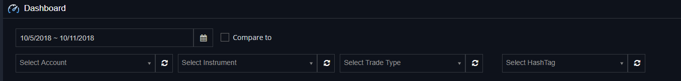
Enter a date range to analyze. If you want to compare 2 periods data click on "compare to". By default it'll compare 2 periods with the same number of days.
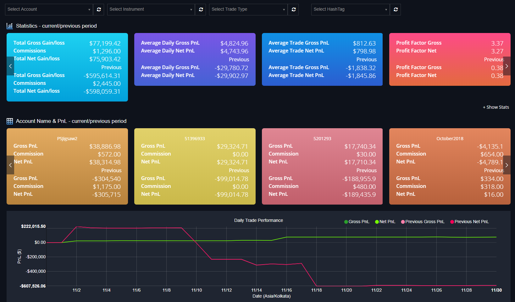
At the top, we can see the statistics panel, you can swipe left and right to see more trading statistics or you can click "Show Stats" for a list.
Then you see the breakdown of P&L by account name. This will show if more than 2 accounts were traded.
The bottom chart (Daily Trade Performance) is the PnL broken down into days. In this case, we are comparing 2 periods. Green is the period from the date selection on the left and magenta from the date selection on the right. If you hover the mouse over any area, you will see the actual value.
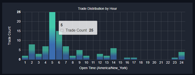
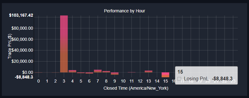
Trade distribution by hour counts the number of individual positions closed in that hour. So that you can assess the periods you (or your team/group) trade the most.
Performance by hour puts trade distribution into perspective. Are periods with more trading also more profitable? Are you making money and giving it back when you are tired? Are you over trading?
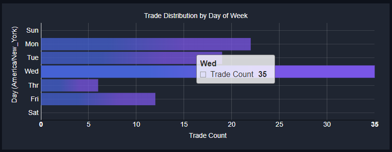
We can do the same analysis for the days of the week that you trade. We all know Fridays can be slower days, are you adjust for that or not? Here's the distribution by day of week:
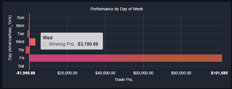
Here's the Performance by day of week.
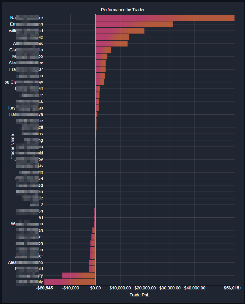
If you are running a team of traders, the next chart is trade distribution by trader. If you are logged on as an individual trader, you'll see trade distribution by account.
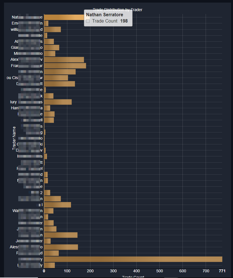
And then of course, we can compate this to Trader Performance by Trader (traders shown in the same sequence on the 2 charts)
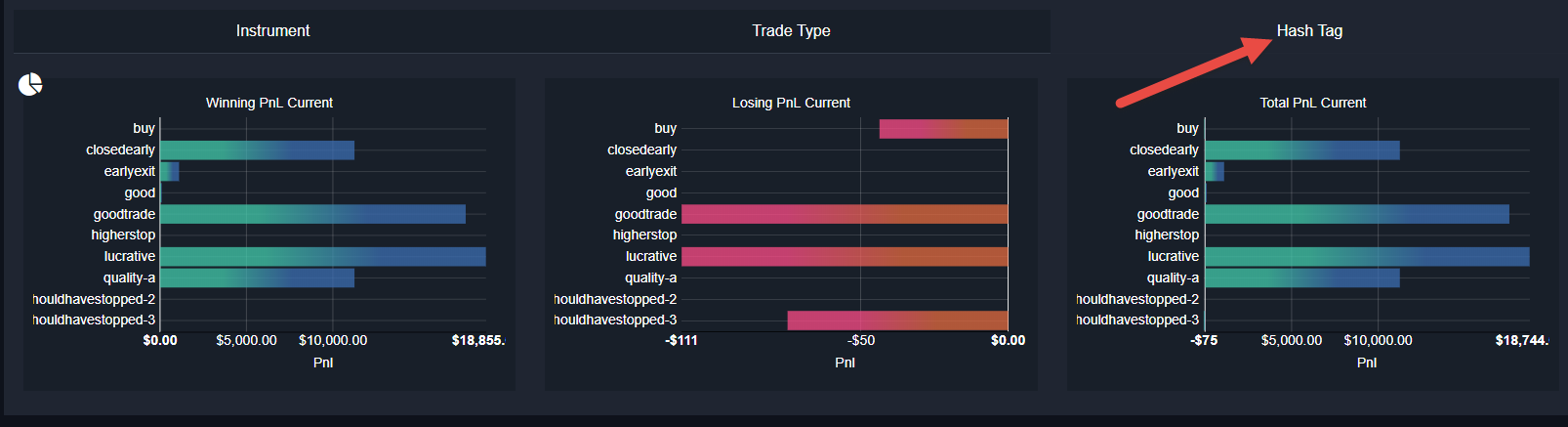
Next we see trade distributions for the current & previous periods:
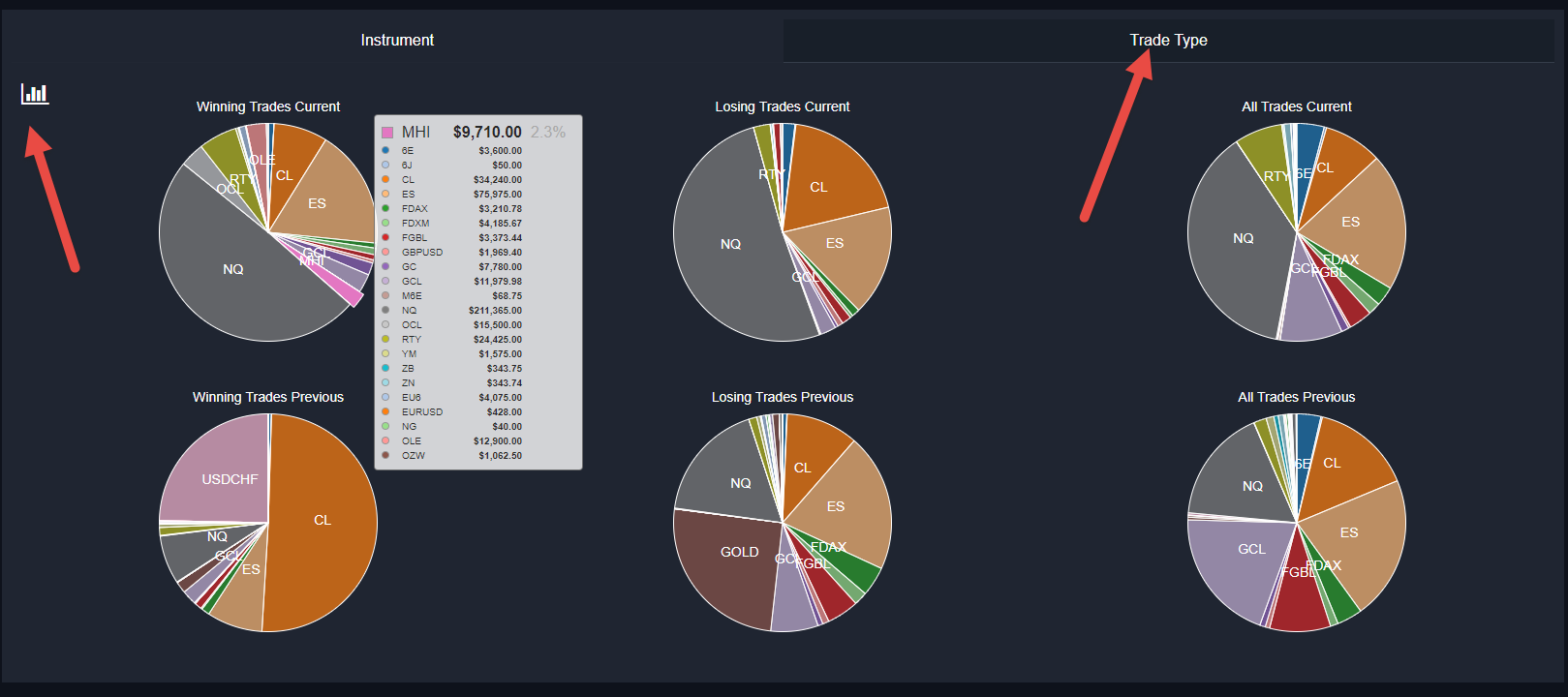
The left most charts show the distribution of profit from winning trades. We can see in this case that more profit came from the ES. In the center, we see the distribution of losses from losing trades. for the current period we made more losses on CL, followed by NQ, then ES (float the mouse over to see the numbers). In the previous period, the ES had more losses. The charts on the right show the trade distribution, we can see ES was the most popular instrument to trade.
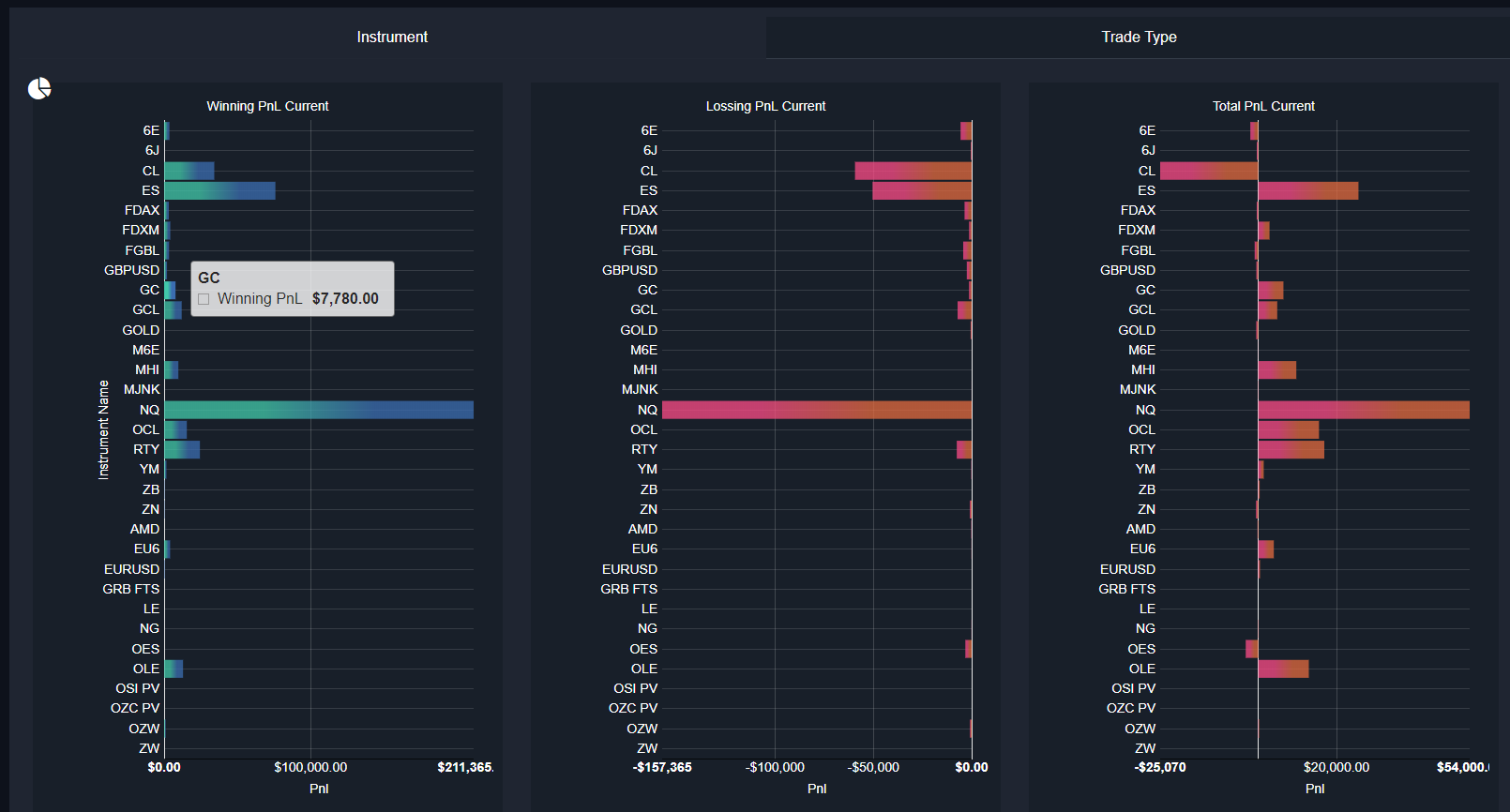
![]() - Click this icon to switch to a histogram view for the same data:
- Click this icon to switch to a histogram view for the same data:
Note that you can switch the above pie/bar charts to show analysis by Trade Type - just click where it says "Trade Type":
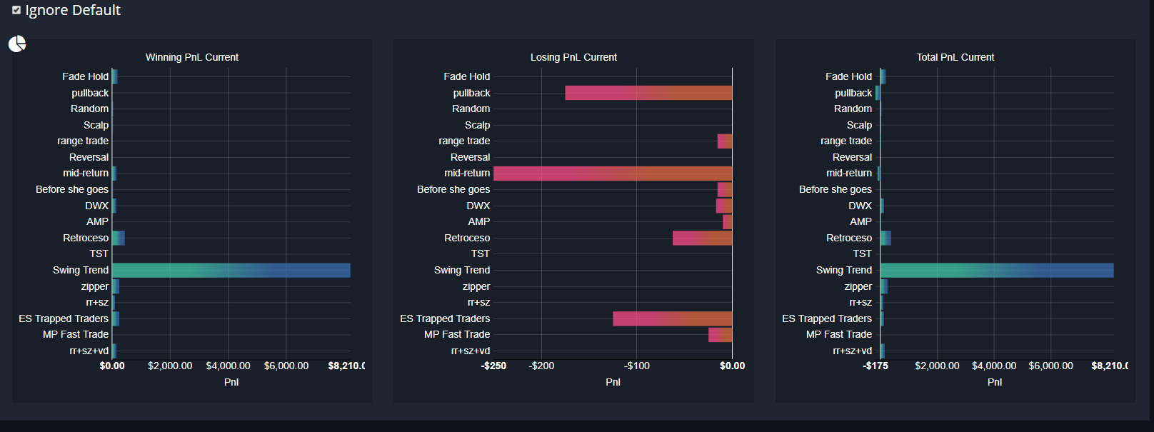
The "Ignore Default" option will prevent the trades being displayed in the Trade Type tab if they have not been assigned a trade type. This is set by default and can be switched off to see all trades.
Finally, we have Hash Tag distribution for all trades